Background
Frame Studio is a conceptual multi-page agency website built to demonstrate the full process of modern web creation, from visual design to front-end development. The project showcases how thoughtful layout systems, color hierarchy, and responsive design principles come together through clean HTML, CSS, and JavaScript coding.
Design Problem
The goal was to design and develop a responsive website that conveys professionalism, simplicity, and modern aesthetics. The challenge was to ensure consistency between visual design and front-end execution while maintaining accessibility and intuitive navigation across all devices.
Design Solution
The final website demonstrates clarity, structure, and motion through simple yet engaging front-end interactions. A flexible grid system ensures readability and alignment, while animations enhance engagement without distraction. Frame Studio highlights the full workflow from design concept to coded implementation, merging visual creativity with development precision.
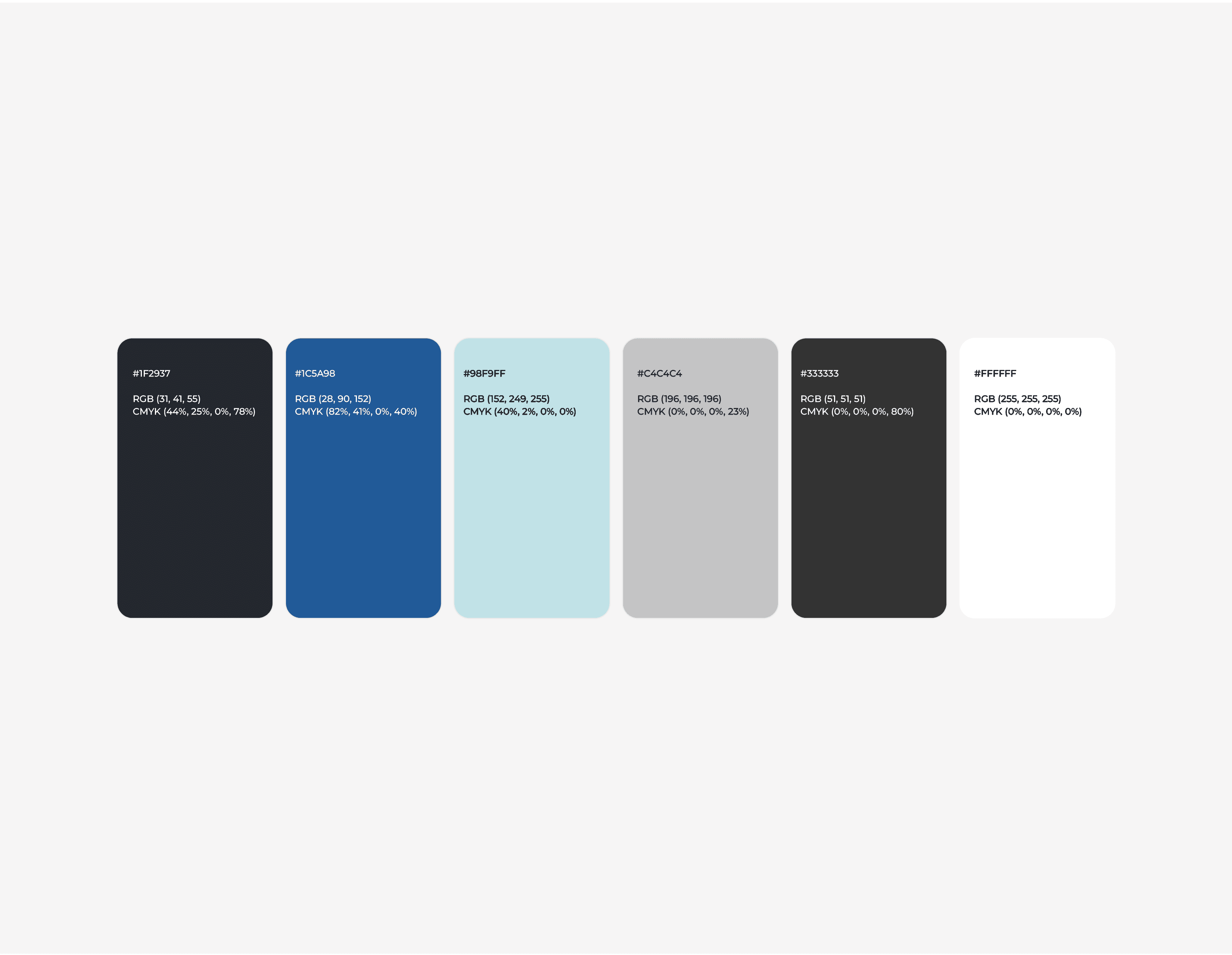
Color Palette
Typography

Layout & Grid System

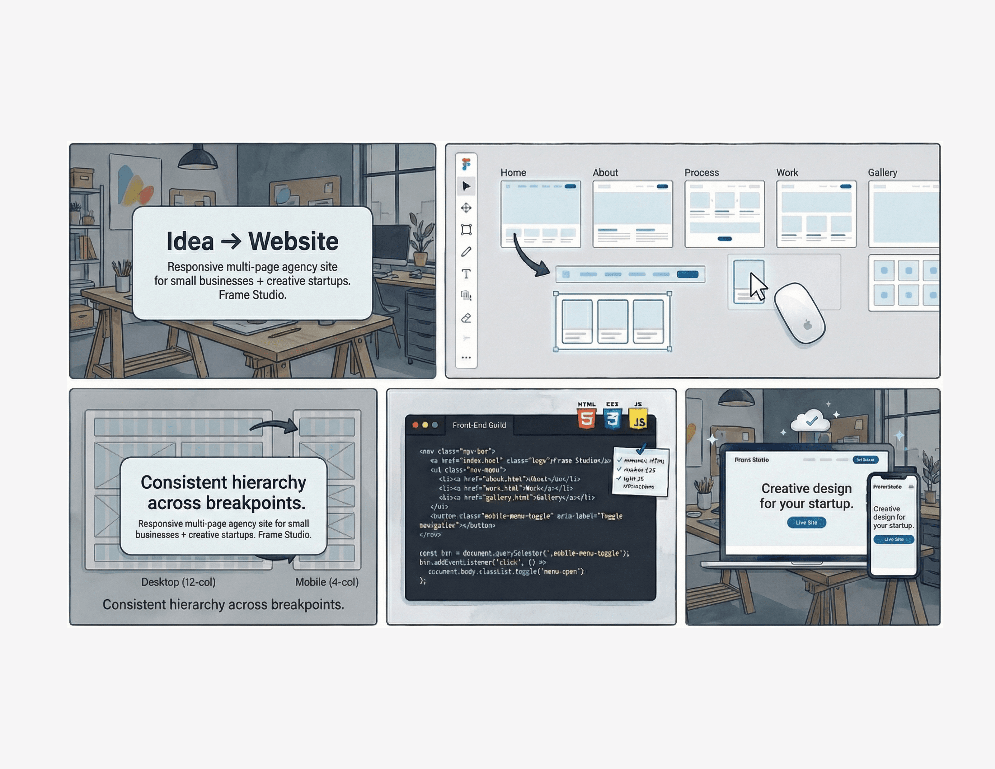
Wireframes

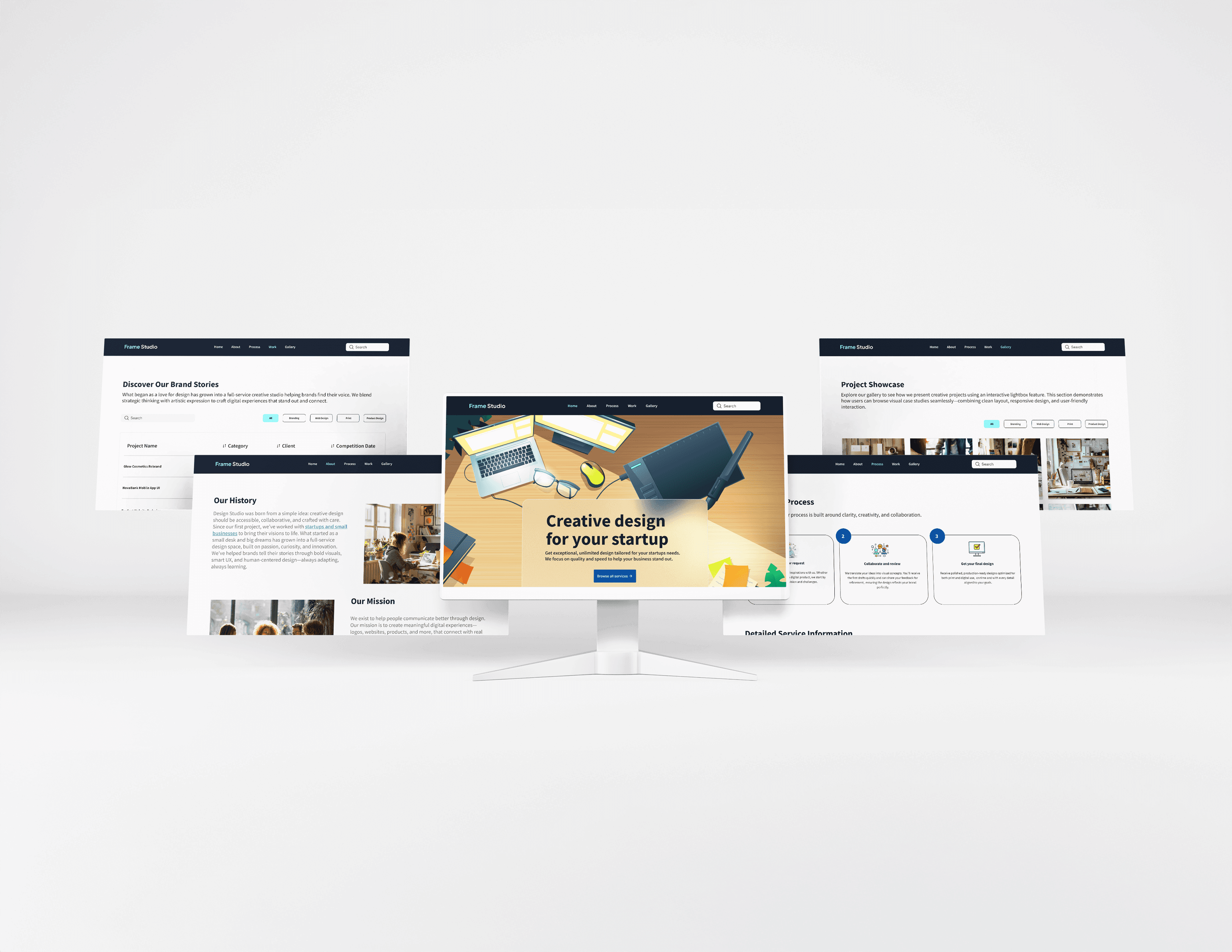
Mockups at a Glance
Built with Modern, Semantic Front-End Code
The Frame Studio website is hand-coded using semantic HTML5, modern CSS, and lightweight JavaScript, all developed in VS Code. The layout is fully responsive across desktop, tablet, and mobile. The site is deployed to the cloud, so it loads quickly and reliably from anywhere.
Outcome & Reflection
This project helped me practice building a real website from start to finish. I coded the layout with HTML, CSS, and JavaScript, made it responsive for different screens, and created simple reusable parts like the nav and cards. Putting it live and using GitHub gave me more confidence working with real code and deployment.